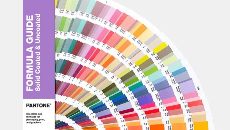
The Pantone color system has made it easy to choose colors with a color catalog in a fan format. Pantone was the first to publish a book on color matching. It has been the go-to color matching method for the design industry for over 40 years. Every year, Pantone color announces a color of the year, “Very Peri” is the color of the year for 2022.
In 1963, it came into existence. The Pantone color system is the world’s most popular color matching system. They solved the complicated color matching system in the printing industry. They have classified every color in every tone and tint and given a number to organize it.
Read this blog to know more about Pantone colors and Pantone color of the year for 2022.

Table of contents of Veri Peri
- What Are Pantone Color Systems And Pantone Color Of The Year?
- Pantone color of the year for 2022
- How Is Pantone Color Of The Year Is Chosen
- Conclusion
What Are Pantone Color Systems And Pantone Color Of The Year?
The Pantone color system is a color matching system that helps classify colors. It uses the numbering system as designed by them; through this numbering system, printers or other devices manufacturers can organize colors. The Pantone color numbers contain three or four-digit numbers followed by the letters M, U, and C, which means Matte, Uncoated, and Coated, respectively.
PMS (Pantone Matching System) has a vast collection of colors on their color palette, up to 1114 colors. This system helps in avoiding color inconsistency between different types of digital and print media. Pantone color of the year is chosen by Pantone Color Institute, a body of American color matching company, The Pantone. Pantone announces a color based on design trends it sees in various industries every year.
The Pantone Color of the Year was established in 2000 by the Pantone Color Institute as a trendsetting notion for branding, marketing, and the creative community. With the establishment of the Pantone Color of the Year, The Pantone Color Institute has cemented its position as the industry leader in all things color.
Veri Peri : Pantone color of the year 2022
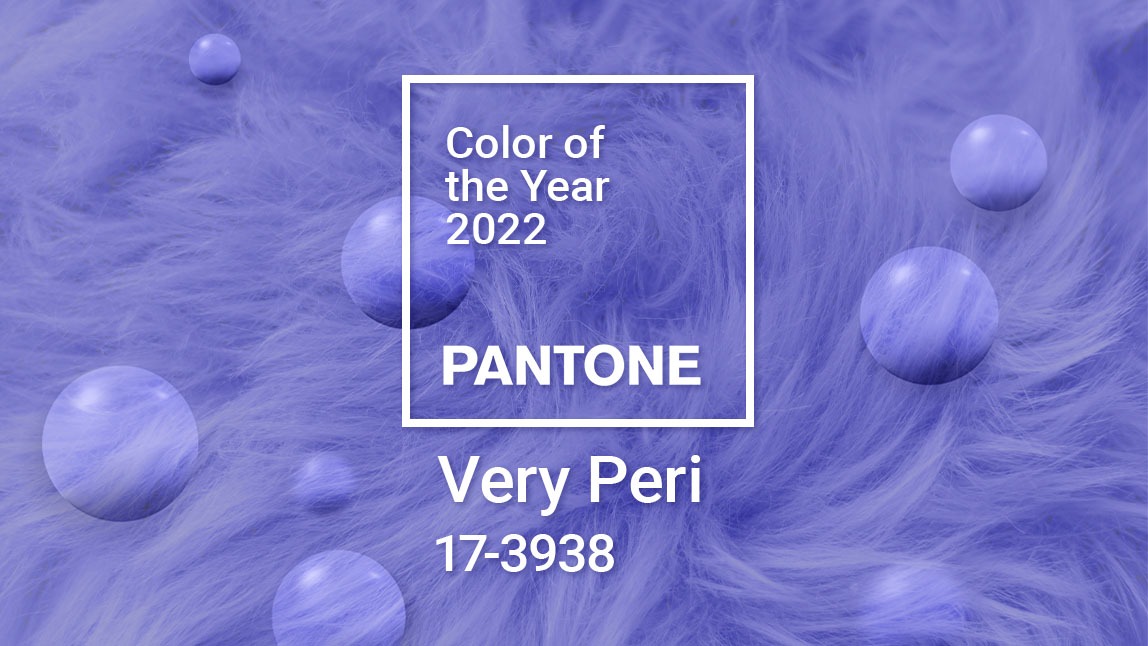
Pantone, the global body of color, has chosen “Very Peri” as the color of the year. They announced on Twitter, Introducing the Pantone Color of the Year 2022, PANTONE 17-3938 Very Peri. A general audience will perceive Very Peri as violet, blue, or purple.
The business describes Very Peri as “a lively periwinkle blue hue with a vivifying violet-red undertone that balances the faithfulness and steadiness of blue with the vitality and thrill of red.”
The brilliant color, also known as ‘Pantone 17-3938,’ stimulates ‘personal ingenuity’ and ‘creativity.’ Microsoft collaborated with Pantone to provide the color palette of 2022 to Edge. In addition, the ‘Very Peri’ theme is available for download in the browser.
Veri Peri : How Is Pantone Color Of The Year Chosen
Choosing a color is not simple as it sounds. This procedure takes about nine months. They have a secret meeting yearly in slate, an intentionally dull, colorless room. Representatives from countries, color standards, and groups discuss their proposals, narrowing it down from 2,000 to one color.
Pantone surveys graphic, industrial, fashion, and other designers, as well as manufacturers and merchants, every year to find out what colors they expect to employ in the following seasons. Based on the polls, sales of color swatches, and expert comments, a color committee composed of Pantone executives and clients makes a decision.
Long before Pantone declares a hue, it may already be widespread in use in particular industries. So basically, they’re announcing what the designers are doing.
Conclusion
Pantone is the primary body in the color matching system. Their methods of classification have helped printing manufacturers in differentiating between colors. Every year, Pantone chooses a color of the year based on design trends in various industries. Pantone collects different data types from industries; based on that data; they decide the year’s color.


