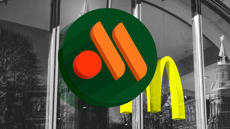
On Thursday, the company verified to the state media that they will be continuing with a new brand logo. Russian Mcdonald’s rebrands itself ahead of its re-opening. The new logo is two lines and a circle which represents two French fries and a burger. They have not revealed their new name yet various options are being considered.
After Russia has sent its troops to Ukraine McDonald’s had temporarily halted its function in the country in the month of May. The chain’s mobile application is expected the be called ‘My Burger’ it will be used for online sales. The company’s mediator revealed that they are planning to instigate an advertising campaign, though they are left to decide on a name. The company has set up fifteen new rebranded outlets in Moscow which start operating this Sunday onwards. About two hundred more outlets will open soon in the entire country by the end of this month.
The logo features “two sticks of yellow fries and a yellow-orange burger,” the company’s press service said. “The green background of the logo symbolizes the quality of products and service that our guests are accustomed to.”
The company hasn’t yet disclosed the restaurant chain’s name, though its mobile application changed to “My Burger” on Friday.
McDonald’s employed about 62,000 people in Russia and the hasty removal of the golden arches became a symbolic moment in the exodus of foreign companies from the country in response to Putin’s war. McDonald’s was one of the first Western brands to establish itself in Russia as the Soviet Union neared collapse at the end of the Cold War.


